

Sustain Able
“My actions can cause an effect and make a difference.”
Snapshot
The Problem
Although people are now more informed than ever about human impact on the environment, there’s still a discrepancy between awareness and action.
This capstone was a passion project for me. It took a long time and a lot of research to reach a place of low waste and sustainability for myself. I realize not everyone has the time to do the research so I wanted to provide a resource to help those that were interested along on their eco-journeys.
The Goal
Bridging the gap between awareness of environmental issues and eco-action.
I want the user to feel empowered, make habits that are helpful for themselves and the planet, and most importantly - feel ready to delete the app one day.
Overview
Role: UX Team of One
UX Researcher
Visual Designer
Interaction Designer
Tools Used
Pen & Paper
Post-it Notes
Miro
Marvel App
Figma
Duration
4 months
Insights
The ingredients for eco-conscious behavior:
The Right Information
People need to know both why an action is important and how to do it. If you’re unfamiliar with anything there’s some hesitance to do it. New actions should be encouraged in a safe environment to be reassuring.
Slow Introduction
You can’t be thrown into eco-actions right away. Major changes can be overwhelming so you need to get people comfortable with one easy behavior before trying another.
Affordability
How you feel about the environment impacts your actions, but regardless of how much you care, if the behavior “costs” a lot whether that be time, money or anything else, the chances of you acting on that behavior is very low.
Final Design

The Process
Research
My first step in solving this problem was to get more familiar with the space. I turned to research papers on green behavior that addressed motivation, psychological factors and awareness.
From this I learned that In order to make a change in behavior one must inform about environmental issues, explain how actions affect the environment, suggest actions with low cost and that combined would hopefully lead to formation of habit.
Competitive Analysis
I compared three apps that were looking to help people live more eco-friendly lives by the Nielsen Norman Usability Heuristics most relevant to what I was looking to accomplish in my application.
Recognition rather than recall - the user should not have to remember information from one part of the app to another and the system should be visible or easy to get to.
Flexibility and Efficiency of Use - which would allow users to tailor their experiences on the apps.
Aesthetic and Minimalist Design - only relevant information should be on the screen, any clutter would affect the visibility.
Diary Studies + User Interviews
I had 7 people volunteer to participate in a diary study, all interested in being more sustainable in their everyday lives. In it they recorded 3 times a day for 3 days when they were either performing an eco-friendly action or one that wasn’t. If it wasn’t, I had them then write down if they knew of an environmentally friendly alternative to said action. The goal was to bring intentionality to their actions and gather insights into what they were thinking about and doing in each of those moments.
During the user interviews following the study, I asked 6 of those same participants about motivations, obstacles and where each participant got their information from when they had questions. All had stated the diary study had helped them think more about the action they were taking, but there were many obstacles standing in the way of forming habits.
“I like being eco-conscious and finding a lot of different ways and information to be honest about things that would be better because I also don’t know a lot and I think eco-friendliness and how things might affect the environment are such a complicated matter that sometimes is hard to understand really what you should and should not be doing.”
Define
I used the information gained from the diary study and interviews to create my affinity map where I grouped patterns to inform my user persona.
Emerging Patterns

Information Balance
When feeling overwhelmed with information, people stopped searching.
On the other hand, some people couldn’t find enough information.
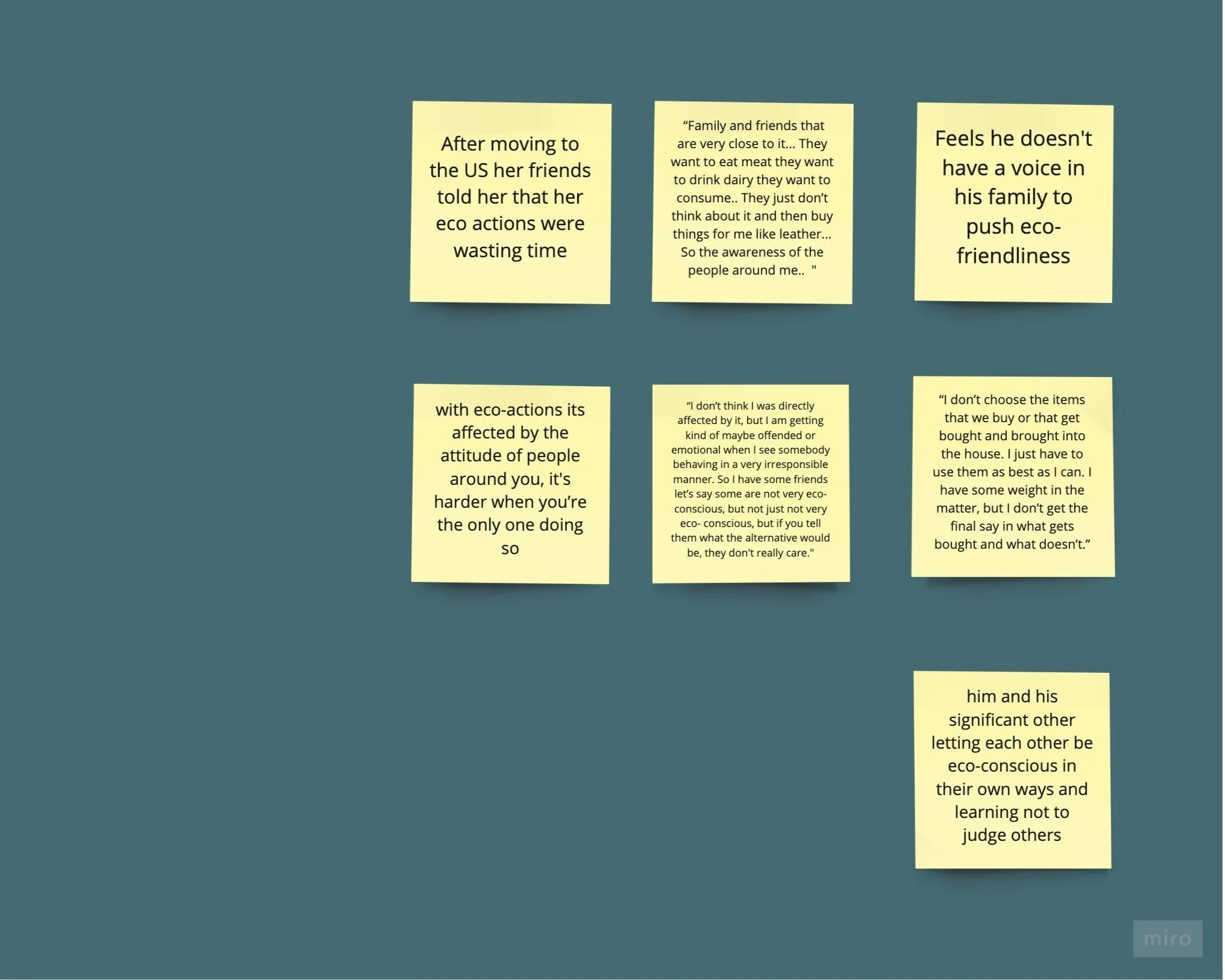
Social Support
It can be hard to act eco-consciously when you don’t have the social support around you.

Accessibility + Reassurance
People want reassurance for the things they were doing that were eco-friendly because otherwise feelings of self-judgement occurred when people forgot to do something, couldn’t do something or were unsure of what they were doing.
Persona
“There’s not enough resources and some are confusing while others are overwhelming with too much information. When it’s too much, I just give up. Finding alternatives is hard.”

Meet Greg the Learner
For him sustainability has a lot of feelings of confusion. He knows plastic is bad, yet still sees it used everywhere and knows it's usually the cheaper option.
With the amount of information on the internet about it, it’s overwhelming and hard for him to find reliable action on what he should do that’s easily incorporated into his routine.
He is worried about expense and the comfort of his lifestyle, but wants to gain better feelings towards himself and would be helping earth.
Ideate
Mind Mapping
I used a mind map for ideation where I listed out multiple concepts for how to answer the question of how might we provide support and reassurance for those on their eco-journey?
My solution - a platform that provides support and reassurance during one's eco-journey by creating a community, providing information in a digestible format, setting expectations, holding users accountable, and showing their results and progression.
User Stories + MVP
I chose what to specifically focus on in my sketches by utilizing a red route matrix where I sorted my user stories by how many users would use it and the frequency of use to determine where I could make the greatest impact.
Sketches
The features I sketched would allow users to see their progress and current actions right on the dashboard, track their activity day by day in a calendar and quickly pick from a list of actions, and be able to view what they’re currently doing along with what they’ve completed.
Guerilla Usability Testing
From testing these sketches I discovered:
Participants missed the floating “add action” button (FAB) that I intended to be a quick way for adding a new action.
When asked to check on their “progress”, participants either looked on the dashboard or didn't feel the task was complete after going to the “progress tracking”.
Lastly, the language use of the word “current” confused participants when trying to add an action.
Wireframes
I tried to solve these issues by making sure the FAB stood out on it’s own, consolidating the progress and dashboard screens (providing a diagram to display progress right on the home screen), and changing my copy of “current” to “active”.
Wireflow
Depicted are the red route user flows.
Design
Mood board
I wanted colors from nature, but not the usual green that most resources on this topic use. Although green can signify new beginnings and growth, it can also represent a lack of experience. Instead I chose colors from sunset skylines and bodies of water.
Focusing on the feeling of support that users’ wanted from my research helped me go for muted tones of the following colors to convey the sense of light, easy, approachable and inspiring.
Blues = safety and calmness
Yellows/golds = enthusiasm and happiness
Light pink = awe and inspiration
Style Guide
My color palette consists of a teal blue as a primary and gold and light pink as accents. The typography I chose mimics this lightness and simplicity - Montserrat for multi weight options that pair nicely with the readability of Avenir Next.
I continued my trend of the simple feel into the components so they would be as non-distractive as possible, while still helping a user for eco-friendly habits.
With these, I believe I incorporated tones of support, reassurance and motivation through the app.
Test
After implementing the Style Guide into the screens, I conducted usability testing across 10 users in two separate rounds and made improvements based on the feedback.
Findings
Participants were not aware that they could click on the activity diagram I had set up for progress on the dashboard
Most users went to the “Actions” navigation to try to add an action rather than using the FAB and were unclear on its purpose
The filters in the “Shops” screen were missed when selecting a store, participants went straight to clicking on the names of each business
Iterations
To solve the issue of signifying where a user can view their progress, I displayed that the chart could be interacted with by sectioning it off in a card.
For the second issue of misuse of the FAB, I removed it from bottom navigation on screens that did not need it there.
And for the last issue of not seeing the filters, I changed the color contrast for the un-selected state.
In this iteration I updated the visual design by adding illustrations, removing unnecessary cards, and adding in some gamification (a tree that’s leaves would grow as the user made progress).
Reflections
In this project I gained tremendous growth in my visual and interaction skills. I spent about 4 hours combing through Figma tutorials and countless iterating on how to visually make my app appealing while still having purpose for everything on the screen.
Throughout the testing participants found:
That the aesthetic and color palette made the app feel approachable
That the actions themselves were easy to do
That they enjoyed the gamification of seeing the tree grow
As Sustain Able is still work in progress and far from being finished. Some of the hiccups I had like the FAB not always being used will need further solving.
Next Steps
Play with the copy to sound more conversational: "complete" button to “already doing this?”
A/B test interaction options for navigation placement
My metrics for success in this next round will be no issues in selecting, starting and completing an action.