

Kleva Health
Making at home covid-19 testing easy for yourself and your loved ones.
Snapshot
The Problem
What if covid-19 testing could be done from the comfort of your home?
Kleva Health is making at home covid-19 testing as easy as possible. Motivated by the unprecedented times, the team wanted to take the guesswork out of finding a place to get tested and connect loved ones again by making an experience that was easy to follow, reduced anxiety and provided information quickly.
The Goal
Ensuring everything on the user Dashboard was understandable and easy to digest.
Constraints were:
Limited time for user testing
The team wanted to launch ASAP to provide the product to people as quickly as possible
Overview
The Dashboard is where the user will be getting all their information from test instruction to results. I was brought on to take their wireframes to a higher fidelity and keep that experience cohesive with their E-commerce site.
I worked under a Lead Designer and collaborated with another UX Designer who worked on the E-commerce site.
My Role
UX/UI Designer
Information Architect
Interaction Designer
Tools Used
Miro
Figma
Duration
2 month
Insights
Efficiency
Entering the same information multiple times across a platform leads to confusion and unease from users.
Information Processing
Clearly outlined steps that are broken up into sections helps to reduce information overload at any one time and minimizes user error when instructions are involved.
Communication
Keeping the user in the loop every step of the way is essential when dealing with medical information as well as providing a way to get in touch with a medical professional.
Final Design
Images redacted in accordance with NDA
The Process
Redefine
My time with Kleva would be fairly quick and when onboarding it was crucial for me to get an understanding of where the current designs were at and what their design thinking was based off of. To do this I went through their wireframe usability testing videos and personas.
Personas
This project was very different in that the target audience is the whole US population.
This product is for anyone:
Traveling in the near future
Who has been affected by covid-19 or went through the testing process
That is concerned about covid-19
That is head of family or responsible for family members who might be vulnerable
When I was done with the videos, I put together a report that highlighted the usability issues in both the E-commerce site and Dashboard in order to prioritize what would be updated.
Patterns

“Register Kit”
Information previously collected in the E-commerce was collected again, confusing participants. They also didn’t understand the confirmation message that appeared at the end of registering.
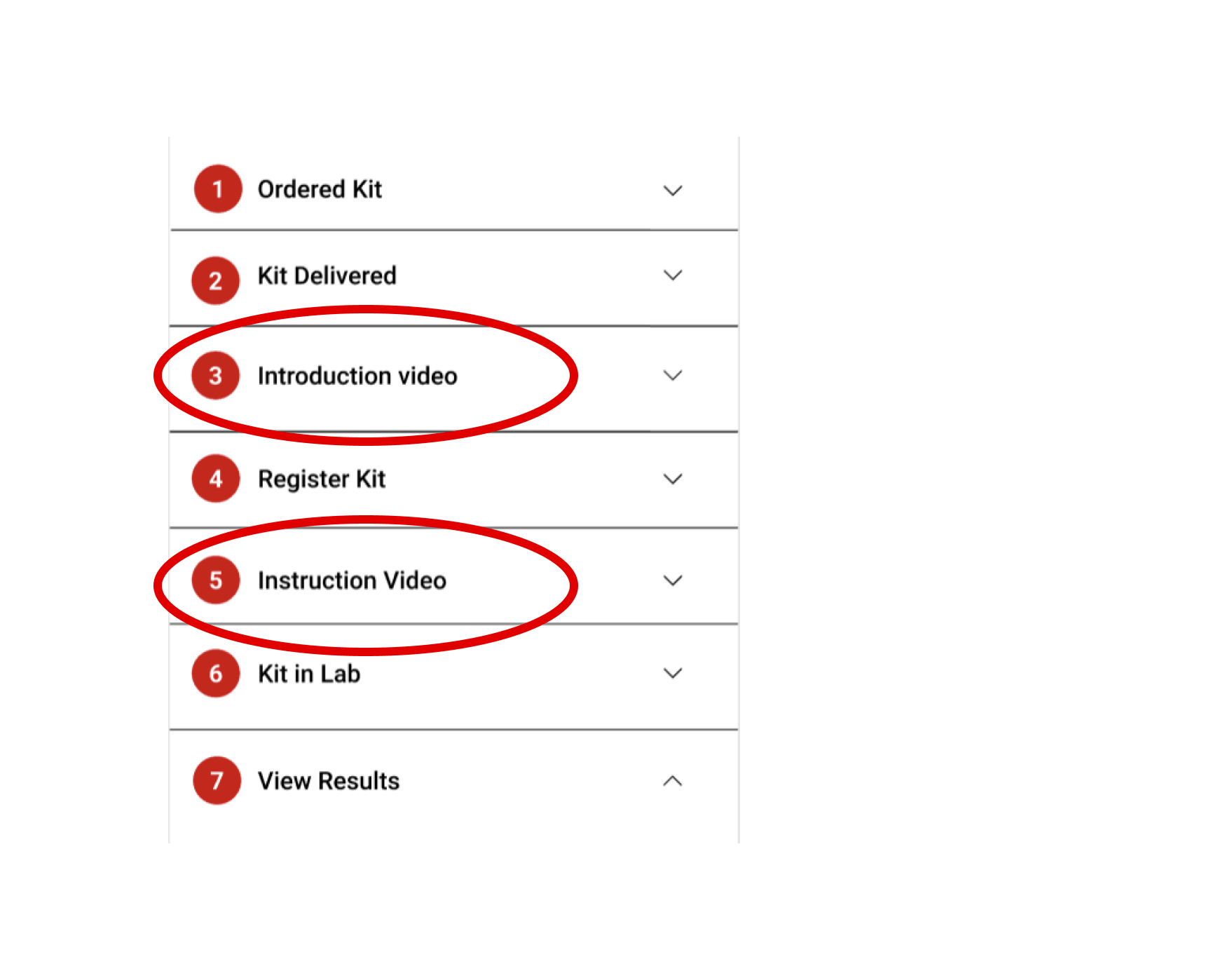
Introduction vs Instruction
Participants were confused by why there were both an introduction and instruction video.

Login
Participants were uncomfortable with the thought of signing in with socials since it is a platform informing them about their health.
Information Collection
The pattern that really stood out from the interviews was that participants did not like putting in their information multiple times.
I refined what information was collected by going through what was being asked across the E-commerce site and Dashboard and refining that information to only what was absolutely necessary.
After discussing what was needed in each step with the rest of the team, I was able to cut out everything from “Register Kit” minus the ID confirmation. This ultimately simplified input for users on the Dashboard.
User Flow
Next, I flushed out the user flow before jumping into the design iterations.
The previous flow was planned for one user taking their test at a time. In it the user clicks through each step in the instructions needing to enter duplicate information. What happens if results came back positive was also not crafted out yet.
In this new flow I’ve accounted for test transfers, renamed the steps to what the user will be doing at each point in time, and added in what would happen when consulting a doctor.
Design
Content
A big portion of my time was spent on the content for the Dashboard that needed to be distilled down, both from papers that explained how to use the saliva collection device and ones that explained what information was to be displayed for testing results. For all the copy in the Dashboard, I created a Google Doc for the team to reference if any changes needed to be made.
For the instructions I broke down long run-on sentences into declarative ones when possible to make sure the user would be able to follow along
For the results I kept the language as non-medical as possible
Sitemap
Initially, I was given two sitemaps for reference, but soon noticed that these did not clearly outline if the Dashboard was able to be accessed from the E-commerce site. This was a blocker that led to internal discussion and confusion about navigation on both sides. The diagrams did not quite match up with what the stakeholders wanted for the platform.
During our next meeting I described what I believed they wanted, providing an alternative sitemap that was the ultimate one used.
Mid-Fi Mockups
When iterating on the mockups, the other designer and I worked closely together to make sure that the designs were cohesive and followed the design system that she created.

Confirm Kit ID
I replaced the title of Kit Registration with Confirm Kit ID to indicate to the user that their kit had indeed been registered along with removing all data entry except the ID itself.

Testing Steps
I distilled the steps down from 7 to 4 and renamed them with the goal the user would be completing in each section.

Sign In
I removed the social media logins and added an illustration of medical professionals to reinforce with imagery that this was for healthcare.
Example Screens For Mobile + Desktop
Test
Testing was conducted remotely on 5 participants and the test itself consisted of going through both the mobile E-commerce site and the Dashboard.
Testing Objectives
Initial impressions of screens
Uncover usability issues
See interaction follow through from completing order to receiving results
Test Tasks
Purchase a test kit
Go through the instructions of taking the test
Tell me about your results
Findings for Dashboard
Static images were used for testing and participants questioned their usefulness, stating better visuals would be helpful
Participants wanted to know the turnaround time for their test results and how long it would take a physician to contact them if tested positive
Next Steps
I went back to the prototype and clarified that a physician would contact within 24 hours, but the images would need to later be tested to see if users could follow along better.
Handoff
Communication with the development team during my hours looked like a very neat Figma page that had occasional comments for fixing, which the Lead Designer updated when any changes were made on our side. During the handoff meeting with the developers there were a few hiccups that were run into when it came to user flows regarding more than one person. But that was easily solved by removing screens that allowed for multiple users to take tests on one account from previous designs.
Suggestions
After submitting my final designs, I wrote up a document with some suggestions for continuing forward. These included:
A/B Test scrolling through the Test Instructions horizontally vs vertically to see which is preferred
Having a UX Writer go over all the copy in the Dashboard to make the information more digestible
To add a version of the results if the test comes back inconclusive
Reflections
It felt very fulfilling to work on something that has the potential to help a lot of people. While challenging to keep the experiences cohesive while working with another designer in a different tools and a team in a different time zone, it helped me stay adaptable.
Through learning to be more comfortable with taking initiative to solve potential problems before they became issues I was able to reduced information overload on the Dashboard, solidify brand trust based on 5/5 usability tests and increase company profit by eliminating the need for refund transaction fees at 2.9%.