
PostUp
Find a place to work, wherever you are.
Snapshot
The Problem
It can be really hard to find a public place to do work in.
This is the consensus from PostUp users* - a platform where freelancers and remote workers share tips and advice.
*Prompt provided by Bitesize UX.
The Goal
Make it easier to find suitable public places to work from.
The constraints for this project:
The solution needs to be designed as a mobile app
To use places that already exist
PostUp wants to charge a monthly fee to users in exchange for access to the information
Overview
To test out a possible solution I underwent a one person, modified Google Ventures Design Sprint.
Role: UX Team of One
UX Researcher
Visual Designer
Interaction Designer
Tools Used
Whiteboard
Post-it Notes
Figma
Duration
5 days
Insights
After sorting through the user research, three themes kept appearing as most important when finding an ideal location:
Atmosphere
Feeling like it’s not only okay to stay in the public place for a few hours, but an awareness that there are others doing work there too is comforting.
Amenities
WiFi is the number one priority, but when you’re at a place for a long time outlets, bathrooms, and caffeine re-ups are also a must.
Activity
Knowing when a place is busy is crucial to being able to get work done when those noise blocking headphones aren’t working or you have a meeting.
Final Design

The Process
Day 1: Map
Understanding The Problem
Across all users, pain points included having to figure out if there were wifi and outlets, how noisy a place was and if the place was suitable for long stays. A current solutions walkthrough interview was conducted and showed room for improvement in the user journey.
“I would definitely want to know more about the amenities like wifi, outlets, bathrooms. There’s not one great place to find this so I usually need to dig through reviews... It's just really time consuming to dig through and it usually takes a lot of jumping back and forth between site and apps.”
— Chelsea, Freelance Graphic Designer located in NYC
What Worked Well
“Busy times” on Google Maps and Yelp help give an idea of whether there’s a lunch rush and a place should be avoided
A map is good to visualize where the user is in proximity to a place
What Could Be Improved
It takes a long time to compare places and look through reviews to find out if wanted amenities are available
To be able to see the space and layout in the photos would help determine if there is enough seating
Affinity Mapping
From all the information gathered across 10 users, the three categories of information that would help users most when picking a place were atmosphere, amenities, and activity.
Persona

Meet Nina
Nina spends at least 3 days a week traveling around the city for client meetings and remote work and isn’t always familiar with the area.
Often with a few hours between meetings, she tries to find places where she can sit down and get some work done or take a phone call.
Frustrations
Spending more time looking for a place to work than actually working
Finding a place to work and settle in, only to realize there’s not a reliable wifi signal, no restrooms, or that she needs to spend money to stay there
Goals
Spend less time finding a place and more time getting work done
Knowledge of basic amenities before settling in
To find places that aren’t too crowded or noisy in case of meeting someone or taking a phone call
Possible End-to-End Experience
Next, I mapped out what possible user flows would look like and highlighted two main goals that I would use to determine if my solution was effective:
Getting the needed information about a place
Getting the directions to the place
Day 2: Sketch
The second day was dedicated to inspiration from spending time looking at how competitors’ products solved a similar problem and sketching solutions.
Lighting Demos

Busy times lets the user have an idea of whether or not a place is crowded, but not specifically about seat / table availability.
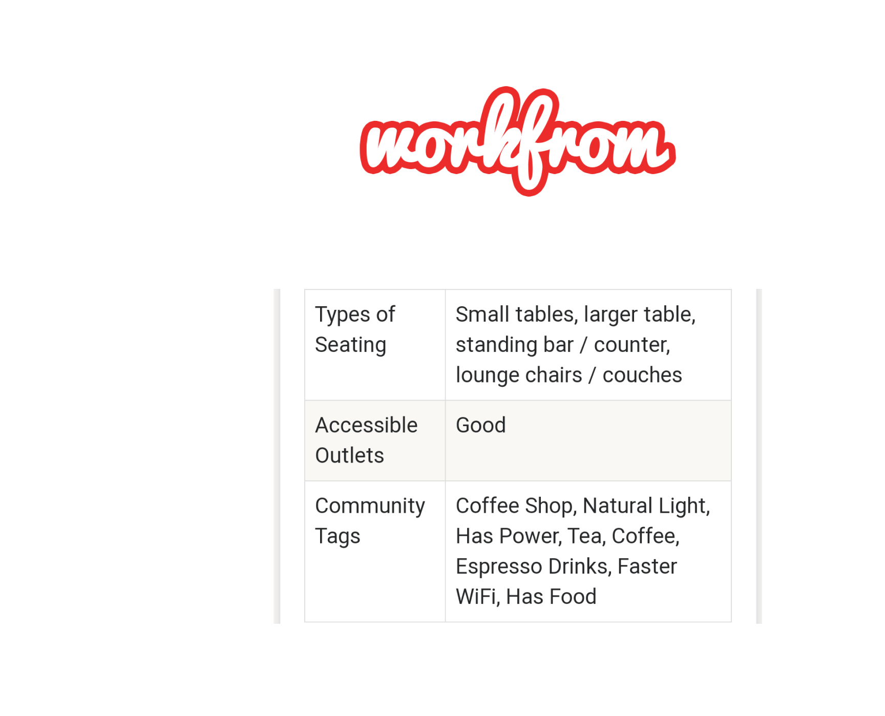
Users can see the types of seating and accessibility of outlets - all provided by other remote workers.

Reviews for amenities are provided by other remote workers and are easy to see.

Personalized filter options are shown for the specific context of what a user is looking to do.
Crazy 8s
I used this method of sketching 8 possible solutions in 8 minutes to represent how a user would look for and compare places since that would be the most critical part of the user flow.
Finding a place to work looks different for everyone depending not only on what their work is, but from the various tasks they might do day to day. Being able to find a place that matches both wants and needs for the day is the design with the highest impact.
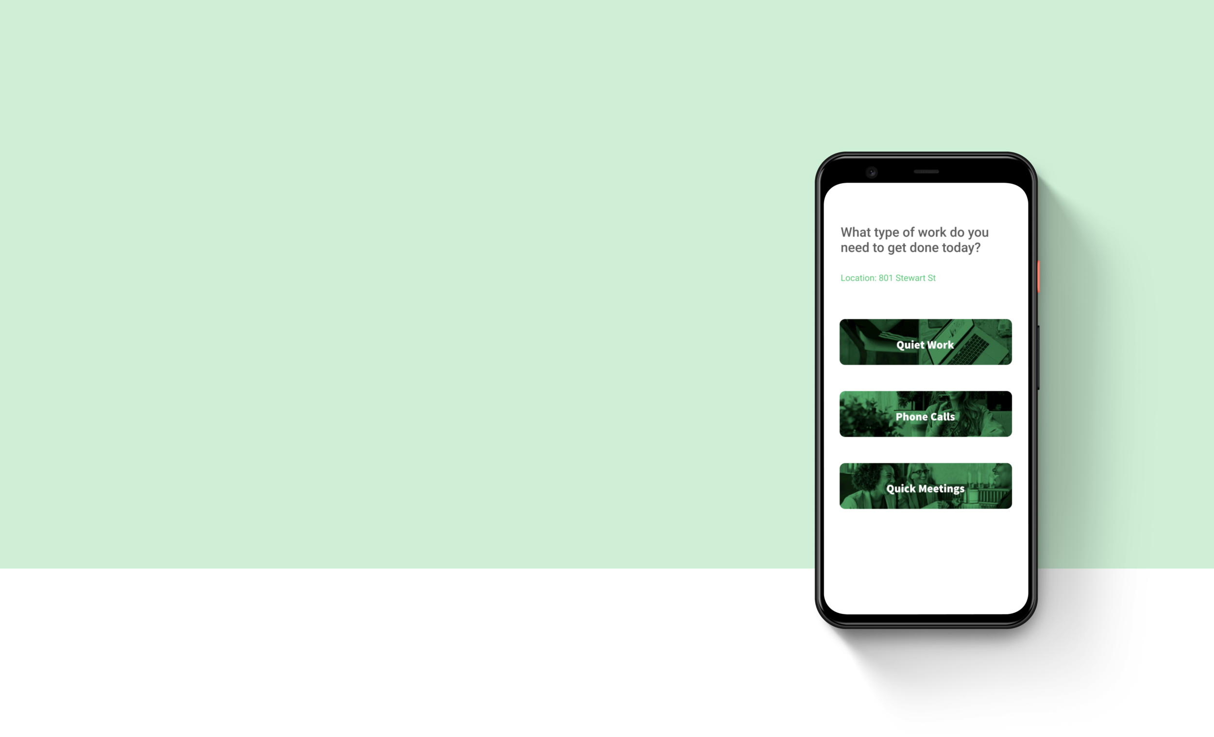
Solution Sketch
For my solution sketch, I realized that filtering to fit the user’s personalization might take more than just one screen. I focused on my critical screen for filtering by things they want in the workspace, the previous to browse by work type and determine the atmosphere needed, and the last screen as the list of places that they can compare from.
This way it really focused on customizing what the user needed for each specific day.
Day 3: Decide
When relooking at sketches from the previous day, I added the icons showing amenities as a quick snapshot to my solution.
Storyboard
To aid users in finding a place to work at quickly, I provided filters and personalized results based on work type needing to get done and amenities wanted.
To address business goals of having users pay for the information, I added in popups that would let them know “favoriting” is a feature that comes with the unlimited subscription and that they only have 3 searches per month for free. The inspiration was how Medium lets users read a few things for free each month.
The incentive (hypothesis) for paying for the app is that since it can be used everywhere and “activity” (how crowded a place is) can change daily, an unlimited subscription would provide this dynamic information.
Day 4: Prototype
I used Figma and made sure to stay true to the rapid prototyping process.
I chose not to spend too much time on getting everything pixel perfect and focused on representing my solution as best as possible in the time frame of 5 hours. I collected my assets first which were a lot of images, then I worried about icons. Everything else was text and I chose Roboto to keep a neutral typography in different weights throughout the prototype which can be viewed here.
Day 5: Test
I tested the prototype across 5 participants who all had worked in a public place at some point in time.
In order to see if my solution was effective, I referred to the 2 goals originally mapped out in my end-to-end experience.
Getting the needed information about a place
In the interviews, I prompted “pretend you are in between client meetings and need a place to quickly go over a presentation with a colleague” to see if participants were able to find a location that fit the needs of a given scenario.Getting the directions to the place
For this goal, I observed whether or not participants clicked through to the “directions” CTA.
Lastly, in order to test the business goal of having users want to pay for the information I included a popup in the prototype that reminded users of how many free searches were left for the month. In the interviews, I looked to hear thoughts on if they’re curious about the payment option.
Results
The first two goals were successful in that 5/5 participants were able to filter what amenities were needed for themselves and find a suitable place, continuing to directions
The last goal was not successful in that most users 3/5 disliked the popup reminder of searches left and prompt to upgrade
All wanted to have the app search by their location or enter more terms like “coffee shop” rather than specific addresses
Next Steps + Reflections
There was a disconnect between feedback of usefulness and easy of the app for finding a place versus the dislike of the popup showing they could upgrade. My hypothesis is that the popup was too intrusive in the flow of getting to the directions.
To re-test if users will pay for this information, I would have a clear signifier to let the user know up front that they only have a limited amount of searches and have an option for upgrading
Seeing how many participants click to upgrade would be the metric for successful conversion.
In the next iteration, I would also make updates based on the feedback above to include a search by location prompt.
Design sprints are great for fast insights into usability and interactions. The practice of making quick design decisions and learning how to manage time within rapid prototyping are now skills that’ll aid future designs of mine!